Identify document and evaluate a minimum of 10 examples of professional designers / studios who have used a range of media and formats to distribute samples of their for. Aim to select a range of media
PART 2;
Produce a short (50 word) SWOT analysis of each of the examples in order to analyse it relative merits and effectiveness as a promotional tool / strategy.
EXAMPLES
HENRIK STEEN KARLSEN
A strong promotional package that looks very professional and smart; this may be because of the foiling and stamping of the logo on each of the designs. It is simple but classic, his work is presented in a bound book. It is effective and iconic in the way he has used silver foil to represent his logo on.
MARIUS WATHNE
This is one of the more inventive ways to self-promote; using chocolate packaging to encase the information Marius has designed. Overall I don't think that actual design of the promotional pack is very strong however the concept and originality behind the design is memorable.
GARRY CORR
This is my favourite of the promotional packs that I have found. It is basic, smart, crisp and clean design that is visually engaging, modern and exiting. Garry has used a variety of medias and print processes which add to the quality of the promo pack within his set and they all work well together.
ASHLEY SPENCER
Although this piece of promotional design is simple and does not stand out in its appearance; I think that it is the simplicity and clarity of the message that Ashley has chosen to use that will be effective as a promotional piece.
The combination of info graphics and typography work well together however I feel that the quality of appearance of the design is the main weakness, as well as the choice of stock.
KATHARINA SEILER
This promo pack is not very visually engaging but instead the interests lies in the delicacy and originality of the pack itself. The binding and choice of different stocks make the booklet visually engaging and smart. I think the weakness of this piece is that there is no self promotion in terms of type or image (actual designs, and instead she just relies heavy on photographs of her work, there isn't much information about her as a designer.
LUCY FINCH
This is definitely one of the more humorous, memorable and innovative self promotion packs. It is well thought out and very engaging for the receiver. There is enough information about Lucy in this package using both text and page. You can gain a sense of her character / humour and the type of design that she is interested in (packaging). Although I don't really like her logo and colour choice, overall I feel this is a very strong example for a successful concept for a promotional pack.
JOSHUA MIDDLEDITCH
This is another simple but smart promotional package focusing on print and print processes (embossing). It is purely typography based on the exterior with his work arranged on the inside - the colour images contrast well with the black choice of stock. The choice in bailout (black bubble pack) will also stand out when posted in the mail, making it easier to be remembered.
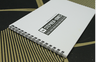
STEPHAN JONES
I don't really like the overall design of this promotional pack but I wanted to include it because of the appearance and how it has been carefully thought out and professionally put together. The layout of all the work is pretty standard to a catalogue and doesn't really stand out that much, it is the cover of the pack that stand out. It is smart and professional so it does work.
LAYRA DE VALENCIA
Although the design outcome and overall appearance for this promotional package really lets the whole concept down, I wanted to include this because of the originality and idea behind it. Taking something simple and something we use every day (tea / coffee packaging) then adding a bit about the designer.
I think the choice of typeface could be changed and the information on the sides of the packaging could be made more legible, however the strength of this project lies in the innovative idea of everyday packaging.
DANNY PAINTER
This is another standard promotional pack however I liked it because of the colour scheme, the bold choice of typeface and the overall design of it. There is something about some of the layout of the type that doesn't quite work but at the same time, because it doesn't work...it makes the whole promotional package seem more interesting; it could be representing how Danny is more individual and can afford to break the rules of typography....an insight to the designers character maybe?
JOHN PUOPOLO
MOTION GRAPHICS SELF PROMOTION
I wanted to include a self promotion video so because it is another form of media. This video is a combination of type and vector based image. Although it gives an insight into what the basic skills of the designer, it is hard to see the range and examples of his work.


No comments:
Post a Comment